


Last month I shared that we were beginning an alpha testing phase of ProPhoto version 6 with the designers in our designer network. The next step on our release roadmap for P6 is a wider phase of beta testing, starting in just a few weeks.
Starting next month, on December 7, we are going to move ProPhoto 6 into a phase of limited, private beta testing. What this means is that we will be inviting a limited number of regular ProPhoto users to begin using, testing, and providing feedback on a beta-version of the new ProPhoto. We expect to start with a relatively small number of beta testers, but to be adding new testers throughout the month of December.
Private beta means that ProPhoto is closer to being ready for use in real websites, but still has a ways to go before it is full-featured and stable enough to be used by the majority of our customers.
Our next major milestone is tentatively slated for early or mid January. At that point we hope to move to public beta testing — meaning that we will begin offering ProPhoto 6 for sale to anyone interested in purchasing and using it while we iron out the final features and flaws. This means that, if all goes according to plan, anyone who is willing to jump on board early and deal with some bumpiness from the beta stage can start using ProPhoto 6 as early as mid-January.
A word about ProPhoto 6
ProPhoto 6 is unlike any other product we’ve ever released. ProPhoto 1-5 were all incremental improvements and additions of features on top of a stable, underlying concept: a fixed-width website. Now, for the first time in our company’s history we’ve had to throw out the whole underlying concept of how ProPhoto is built in order to lay a new foundation for truly device-agnostic, mobile friendly, responsive websites.
To use a construction analogy, ProPhoto 2-5 were all additions and remodels made to a house — a house which kept getting bigger, nicer, and more fully-featured with each successive wave of work. When starting ProPhoto 6, we realized that we couldn’t build a truly responsive theme that would set us up for years of great improvements and iterations without first, to a great degree, starting over with a brand new foundation.
It’s the depth of the changes we’ve had to make, building a new foundation and rethinking all of the core concepts in ProPhoto, that have led to our missing our target release date of September 2015. But, we feel really great about the new foundation we’ve laid and the building that is already arising on top of that new foundation. We feel pretty confident that it is going to allow us to get awesome power, flexibility, and features in your hands for years to come — which will help your sites quickly adapt and evolve for the future of the web.
So, for all of you that are excited to start using ProPhoto 6 as soon as possible — please bear in mind that, in a sense, you will be moving into a brand new house. It’s not an expanded and improved version of ProPhoto5. In it’s early stages, there are many things that ProPhoto5 can do that ProPhoto 6 will not be able to do. In order to build the new responsive core of P6, we’ve had to concentrate on a small subset of what is most critical and crucial to building a responsive website.
Some of the features and concepts that will be missing from ProPhoto5 will never be able to come back, because they don’t make sense in a responsive world. But many of the polishing features and refinements we’ve added to ProPhoto over the years will definitely be coming back to P6 as quickly as we can build them back in. Users who jump in to P6 at the beta stage can expect a long stream of enhancements and new features to be added back in in the months to come.
In fact, by the time we go to public beta in January (or possibly earlier) we will be publicly releasing a roadmap document outlining features and enhancements that we are planning to release into P6, and the approximate order in which they will arrive. This, we hope, will help us communicate to you our knowledge of all the cool stuff we have planned, and let you know if there are key features you are hoping for, when you can expect them to arrive in P6. This will also be helpful, we think, during the public beta phase of P6 when we will be still selling P5 as an option. We hope our customers will be able to peruse the roadmap and decide based on what is already implemented and what else is coming and in what order, whether they should go with P5 or P6, or hold off upgrading if they so desire.
A Teaser
While it’s true, as I said above, that there will initially be many things that ProPhoto5 can do that 6 cannot, the opposite is true as well. ProPhoto 6 already has a ton of core functionality that delivers more flexibility than ProPhoto5 ever could, and we have a ton of new stuff we’re excited about getting in your hands. And, best of all, everything we’re building is designed from the ground up to function responsively, so your P6 site will intelligently adapt it’s single design and layout to look great on all devices and screen sizes.
One pretty cool thing we’ve just recently added to the alpha builds being used by our designers is a totally redesigned way of handling text and link styling. Instead of many disparate font controls area distributed throughout all of your customization option screens, each with loads of fine-grained controls, ProPhoto 6 allows you to manage your fonts in one central location, where you set up font templates we call “Font Styles”.
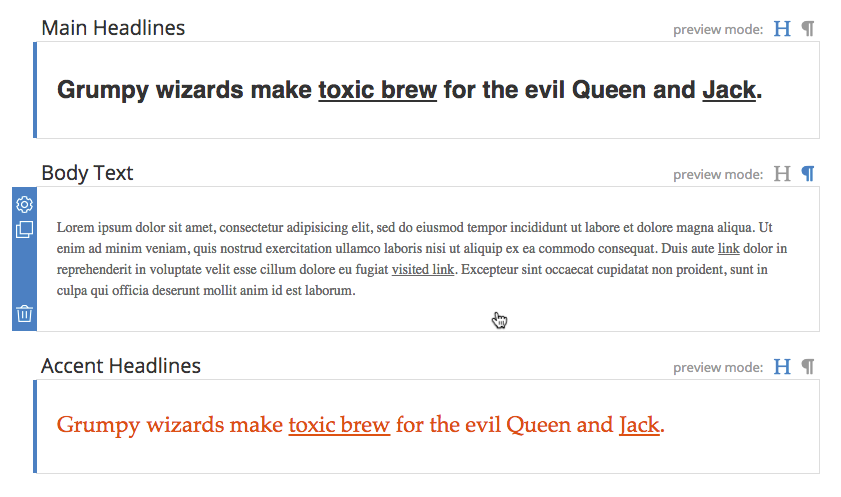
Each style is named, and customizable with a wide variety of customizations.
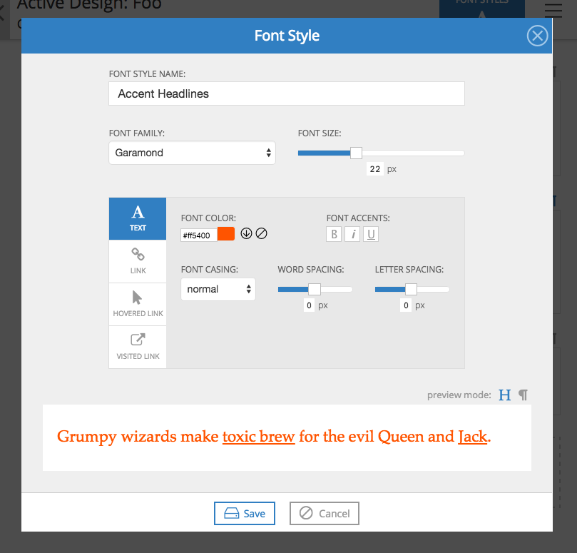
Then, when you need to set fonts for various areas and types of content, instead of exposing all of the font controls, you get to choose from your pre-styled, named font styles.
