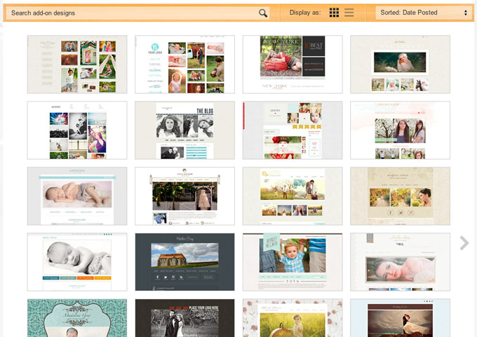
This week we made a significant change to the buy-add-ons page of our site by adding a grid-style layout.

The Old Way
One struggle we’ve had with our store is in presenting site designs in a way that is easy to navigate and highly visual. The way we’ve been tackling this over the last 8 months was to go large.

These large screenshots give a great preview of the design and worked great when we had 30 or 40 designs in our store. Now that we are nearing 100 designs though, this approach has definite limitations. There is quite a bit of scrolling required to see designs at the bottom of each page, which is a little cumbersome and probably has resulted in only the first page, or possibly only the first few designs being viewed by people coming to the store.
The New Way
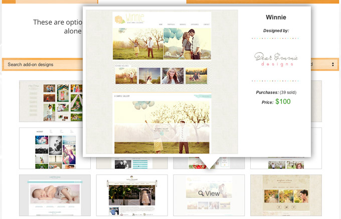
The new grid layout allows visitors to see small thumbnail screenshots of numerous designs without any scrolling. Clicking on the left or right arrows on either side of the grid will slide back and forth between the different pages of designs. A quick mouse roll-over on any of the small thumbnails will bring up a larger screenshot with additional design details.

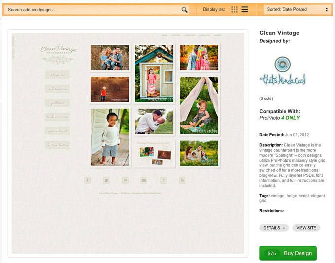
Finally, clicking on the thumbnail will take you to the design page where you can see even more detail, view a demo site, or purchase the design.
We feel that the result is an interface that is very responsive and easy to navigate, allowing you to get a good look at a large number of designs in a short period of time. We liked it enough to make it the default view when visiting the store (although if you prefer the old view, or just despise change, you can still select the old layout from within the header bar of the store)![]()
Try it out for yourself: http://www.prophotoblogs.com/buy-add-ons/
Love it? Hate it? Come back and leave a comment here and let us know what you think.


