We’ve been starting to get a lot of questions about Apple’s retina displays, and whether ProPhoto is compatible or takes advantage of these new screen types. This post aims to explain what these retina screens are, how they work, how they affect websites, how we are currently dealing with them, and what we plan to do in the future.

The newest iPhones, iPads, and Macbooks all sport "Retina" displays
Retina displays were introduced in the iPhone 4, and since have also appeared in the 3rd generation iPad, as well as in very new Macbook laptops. A Retina display has extremely small pixels and a much higher density of pixels per square inch.
Two Kinds of Pixels
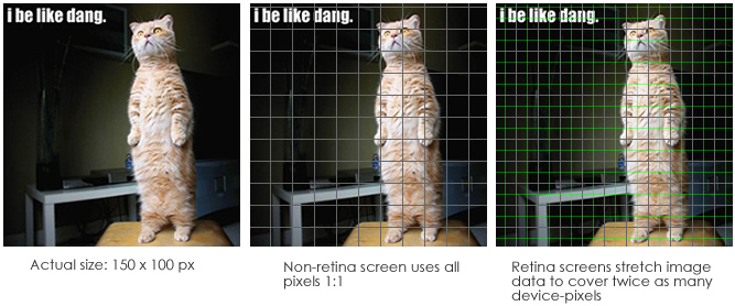
The pixels on a retina device are so small that if websites were rendered at their actual size, they would be too small to see clearly. So, for the purpose of simplifying using a retina device to view websites, Apple makes a little internal calculation behind the scenes: they put two of their tiny pixels together and call it one normal pixel. The tiny retina-sized pixels are called “device pixels” or “hardware pixels” and the normal pixels are technically called “reference pixels”, but I like to think of them as “normal pixels”.
![]()
Retina displays and image resolution
What that means is that if you’re viewing a website on a retina device, a website that is 1000 pixels wide is rendered using 2000 device-pixels. This is nice because it means that websites still “just work” for retina devices. However, it also means that images viewed on retina devices do not by default take advantage of all of the device-pixels available.For example, a 600px by 300px image will actually use 1200 by 600 device pixels of space on the screen. Since there are not enough pixels of information in the image to take advantage of the double-density retina screen, the images are stretched to fit over all of the tiny device pixels.

Normally when you display an image using more screen pixels than the image has, the up-scaling causes a noticable pixellated effect and significant loss of quality. The good news is that retina pixels are so small (almost impossible to see individually with the naked eye) that even when an image is upscaled to be displayed over twice as many device-pixels, it is very difficult to see any pixellation or loss of image quality. Most viewers will never notice that the images aren’t actually making use of every pixel.
How websites can use the full retina resolution
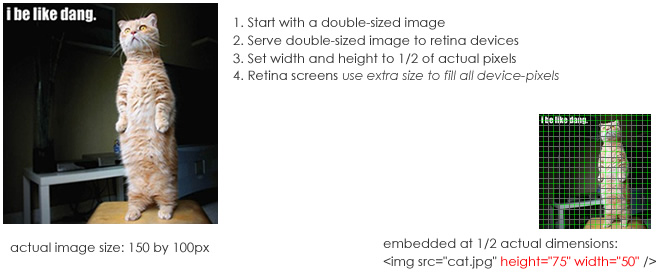
Even though the normal upscaling of web images on retina devices still renders them at a very high quality, there is a way to show images that does take advantage of every device-pixel on a retina display. The trick is to give a the retina device an image that is twice as large as necessary. So, if the image is supposed to be 300px by 300px (in normal pixels), you serve an image that is 600px by 600px but you tell the browser to display it at 300 by 300 normal pixels. When you do this, a retina device will use all of the extra pixels in the twice-as-large image to show it at full resolution, making use of every one of the tiny retina device pixels. The result is that the images look even sharper.

Because, as shown above, it is possible to serve higher resolution images to take complete advantage of retina screens amazingly high device pixel density, and because there are posts and articles floating around the internet talking about how to do it, we’ve been getting a lot of questions about ProPhoto’s support for retina devices. Customers are asking us if we support taking advantage of retina displays, or if we plan to add support in the future.
Retina support in ProPhoto right now
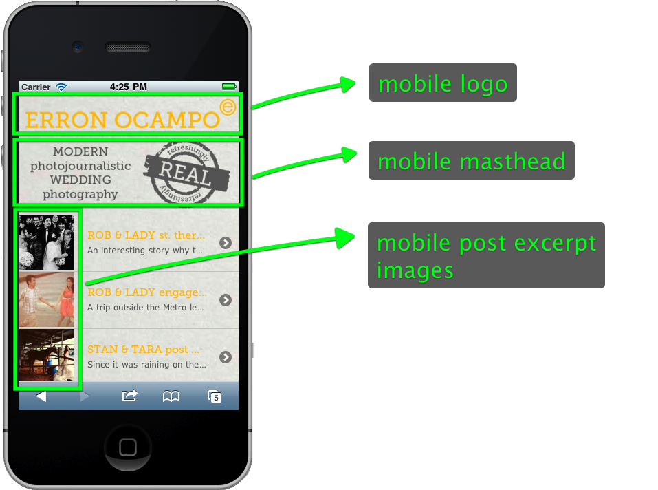
Currently, we do a limited amount of retina-specific support just for mobile sites viewed on retina iPhones. The logo, masthead, and the small post excerpt thumbnails on ProPhoto mobile sites are served to retina iPhones at double-size if available.

these mobile image areas ALREADY support retina resolution
Other than this, we don’t currently make any special allowances for retina screens. Your ProPhoto sites still work perfectly on retina screens, only the images are automatically stretched to cover the extra device pixel density. Again, this stretching is normal and almost imperceptible. There is no real visible pixellation or image quality degradation. 99.9% of all websites on the internet function this way.
Retina support in the future
As far as future or expanded support for retina displays goes, we’re kind of in a “wait and see mode”. Retina displays on large-screen devices like iPads and Macbooks are very new, and there has not yet emerged a consensus “best practice” about how to build websites for them.
We could build in support for always delivering double-size images for retina devices, but this has some serious drawbacks. For one, it would be pretty complicated to implement, but even more important, double-size images for large screens would cause sites that show a lot of images to be very slow to load. For this reason most major websites have resisted doubling image resolution. Since ProPhoto serves mostly photographers who post lots of images, this doesn’t seem like a workable solution for now.
For now, it makes sense to serve double-sized images for small or specialized images. That’s why we’ve taken the approach we have with mobile retina image support. By serving a few smaller images with retina-sized images, we can get a little extra resolution into some key areas without slowing down the site too much.
We’re watching carefully what the web development world does with these new retina displays. There are some emerging HTML standards that may help us in the future, but it will likely be years before there is enough browser support to use these new features. As best-practices begin to emerge, we will look to integrate them into ProPhoto as quickly as possible. But for now, it doesn’t seem wise to build complex functionality that will slow down your sites while the technology and recommended practices are still just emerging. 99%+ of websites on the internet are not doing anything specific yet for retina displays. We feel good about including limited retina images support where it makes sense for phones and waiting to see what our next step might be.


