Today we’re pushing another auto-update with new features to ProPhoto 6, version 6.4.0. Highlights of this release include:
- Thumbnail-style galleries
- Gallery “Full-window” mode
- Responsive call-to-action items
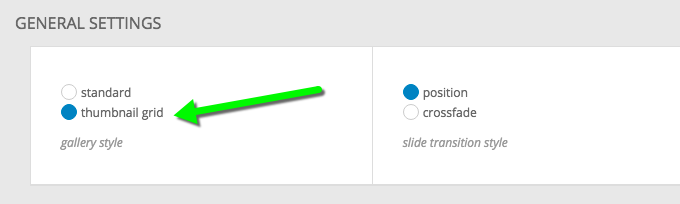
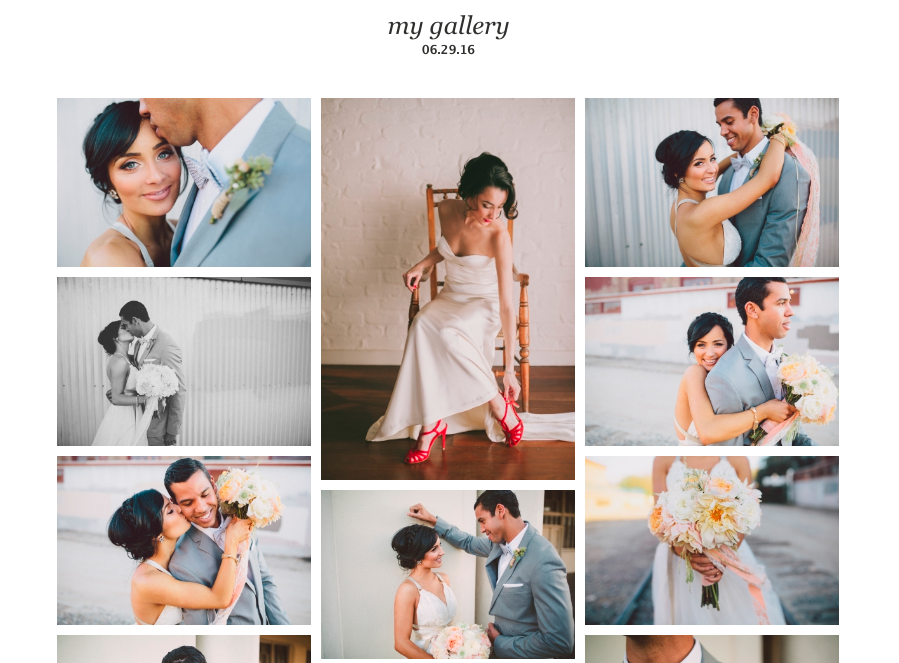
Thumbnail-style galleries
P6 galleries now can be displayed as a responsive grid of thumbnails:
These thumbnail galleries can be cropped or masonry style, and you can control the sizing like you can with regular ProPhoto grids:
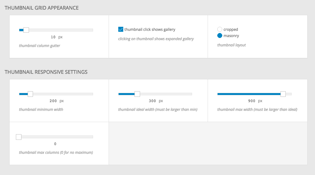
You can choose to have the gallery be only the thumbnail view, or to have clicks on individual images spawn full-screen or full-window gallery mode.
Gallery full-window mode
Galleries now support two “expanded” modes — fullscreen and full-window. Fullscreen is the same as what has been in P6 all along — a fullscreen experience without any browser chrome (for browsers that support the HTML5 fullscreen API). In 6.4.0 we’re adding “full-window” mode. This is similar to fullscreen, except it covers the full browser window and not the full computer screen. If you have the opacity of your full-window background turned down to less than 100%, you can see your site content beneath, as shown below:
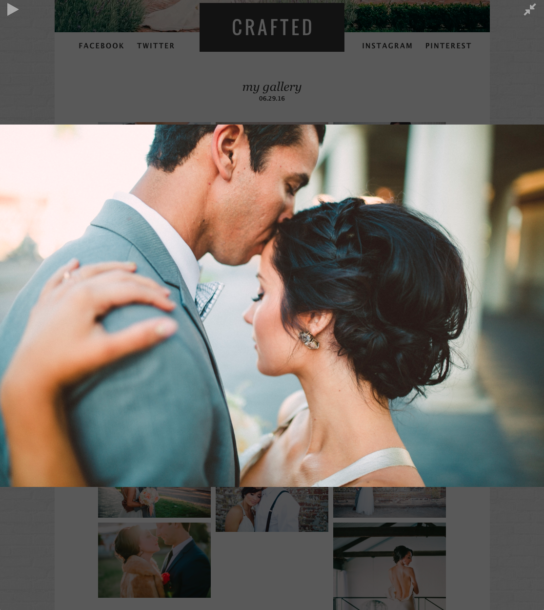
This is a really slick effect, and together with the new thumbnail-style galleries, full-window mode can be used to create a more modern, immersive version of the traditional “lightbox” style gallery.
A really great benefit of the new full-window mode is that browsers that don’t support fullscreen can now get full-window as a fallback. iPhones and iPads do not support HTML5 fullscreen mode, so until today, we hid the fullscreen button for galleries on these devices. Now, with full-window mode, these devices get a great looking quasi-fullscreen experience.
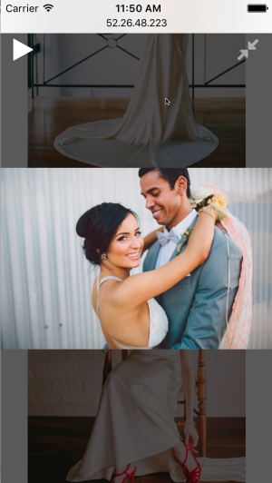
We even style the full-window to look like your fullscreen settings if we’re using it as a fallback for fullscreen on an unsupported device, so you can control separately your fullscreen background and full-window background appearance.
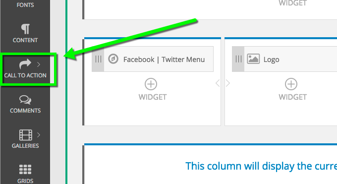
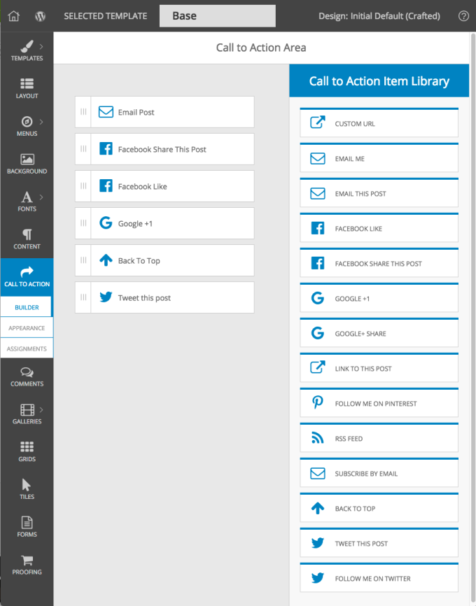
Responsive Call-to-Action Items
ProPhoto 6.4.0 also adds responsive call to action items. To set them up, go to the new area in the customizer:
The Call-to-Action area has a library of 14 different types for you to choose from, and you can assemble your call-to-action items in any order you want:
Each call to action item is configurable:
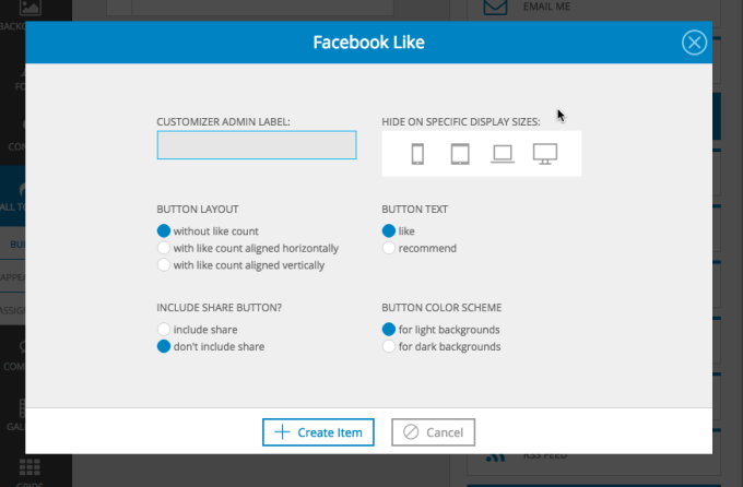
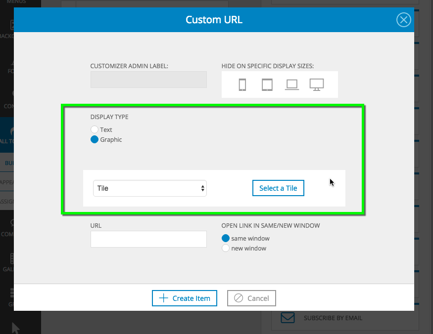
And most of them allow you to set the item to be text, an image, or a tile: