


This week we’re pushing out yet another free feature update for ProPhoto 6. This update, version 6.12.0, is focused on mobile menu toggle icon (hamburger) customization, and grid enhancements.
- Optionally use a tile for mobile menu toggle icon
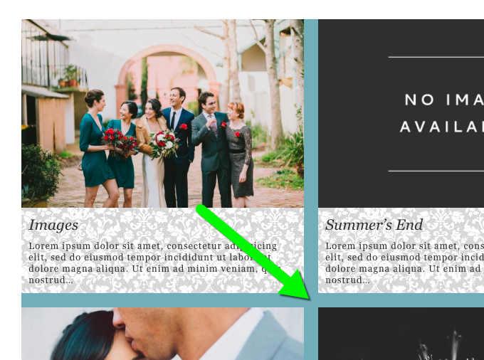
- Custom grid item fallback images
- Grid item and overall background images
- Vertical text alignment for rollover grids
- Post grid item text length control
- Category “featured images” for category grids
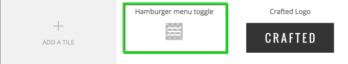
Tiles for mobile menu toggle icon
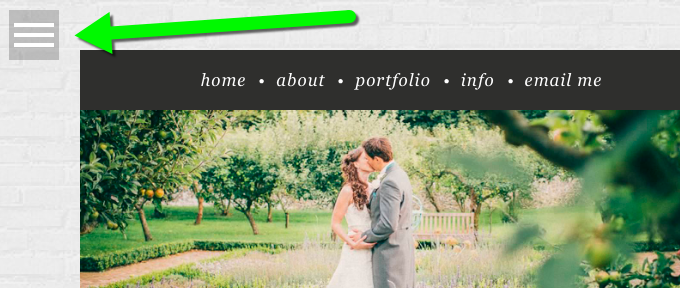
Starting in 6.12.0, you can now use a ProPhoto Tile as your mobile menu toggle icon. The mobile menu toggle icon (often referred to as a “hamburger icon”) is the graphic clicked to toggle the visibility of your mobile menu:
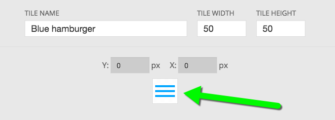
To facilitate supporting tiles for the mobile menu toggle, we made some pretty big changes and improvements to the tile editor. First, we changed it so that the tile hover state now automatically inherits all of the layer’s customizations from the default state, allowing you to modify only what you want different on the hover state, without recreating the base appearance of the tile layer.
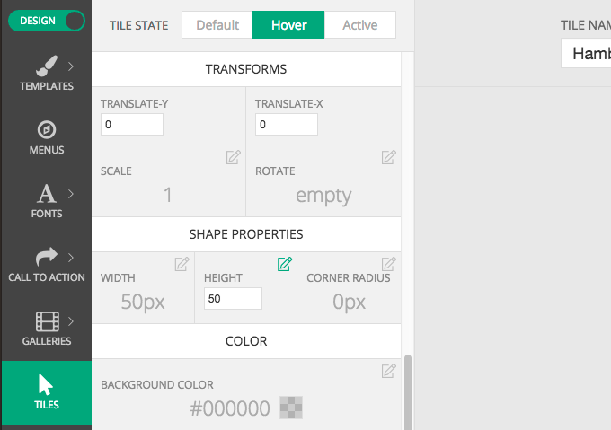
Next, we also added a third state, active, to the tile editor, in addition to default and hover.
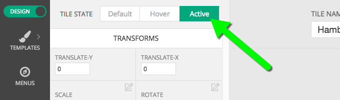
The active state is displayed after the icon is clicked, and the mobile menu is in the open position.
menu toggle graphic in “active” state, when menu open
The active state is currently only leveraged by the mobile menu toggle, but we have plans to incorporate this state into future features and enhancements, including allowing you to set tiles for menu items that have a special active state when the url being visited is the url of the menu item. Stay tuned for more on that.
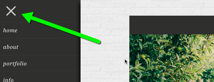
All of our free included designs now start with a tile that looks and behaves exactly the same as it always has, but is a tile:
This should make it really easy for you to start customizing your mobile toggle icon using the default hamburger tile as a base.
Grid enhancements
Also in 6.12.0 are a bunch more grid customization enhancements.
Custom grid item fallback images
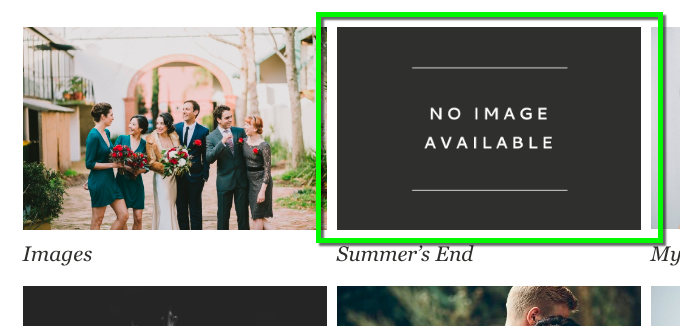
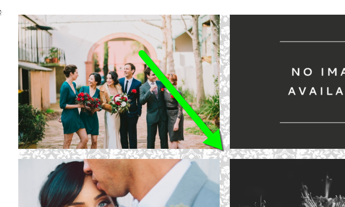
Prior to this release, grid items where no image could be found displayed a default fallback image:
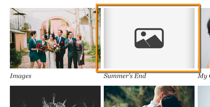
default fallback image highlighted in orange
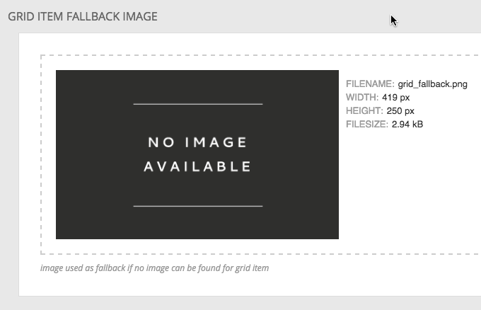
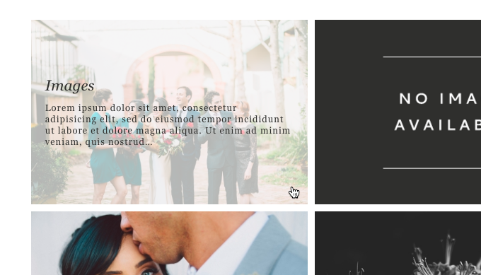
Now, you can upload your own custom fallback image for each style, and override them for different templates, giving you a ton of flexibility.
Rollover-style vertical text alignment
Next, you can now set the vertical alignment of text for rollover style grids:

note the vertically centered rollover text
Grid & grid item background images
Grid backgrounds becoming more flexible in 6.12.0, by adding options for background images for both grid items, and background color and image options for entire grids. These options are now available for both grid types, text-below and rollover.
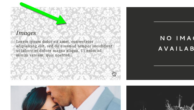
Grid per-item background images can be applied to both styles:
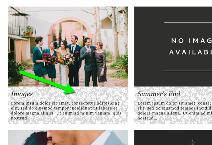
paisley background image applied to “text-below” style grid items
paisley background image applied to “rollover” style overlay
And both styles also now support background color and background image for the whole grid itself. The grid background is usually only visible in the space between items created by a gutter larger than zero. This will allow you to create some cool effects, both with solid colors, and images:
solid color for grid background
background image for whole grid background
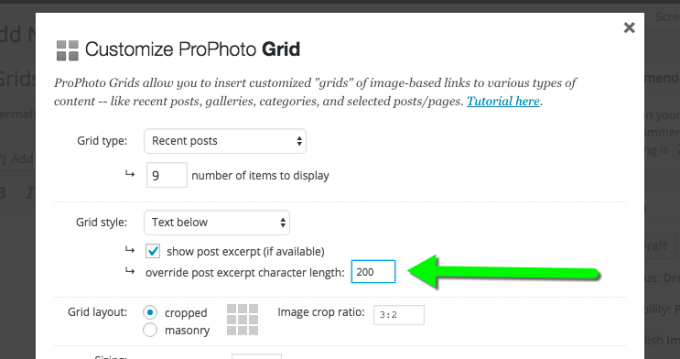
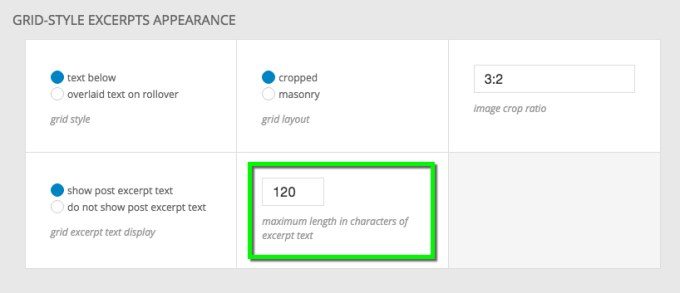
Post excerpt text length control
P6 now supports custom per-grid controls for setting the length in characters of post excerpt text used in grid items.
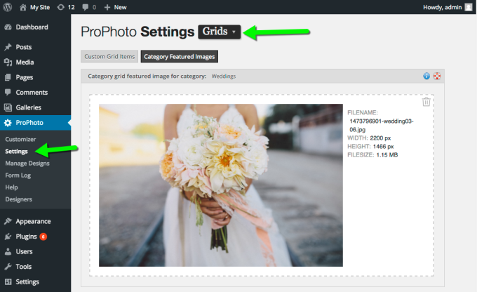
Category featured images
For Category grids, you can now specify featured images that will be used as the grid item image for that category. The upload area is found in “ProPhoto Settings” > “Grids”:
And more…
This release also includes a handful of bugfixes, so, as always you can read all the gory details on the changelog. This release completes our milestone “Miriam”, and we’ll next turn our attention to milestone “Ezra”.