A couple cool feature that we released just before the official 6.0.0 release that got lost in the shuffle and are worth their own blog posts. One of these was some helpful WordPress front-end admin bar helpers we added.
Template name and edit link
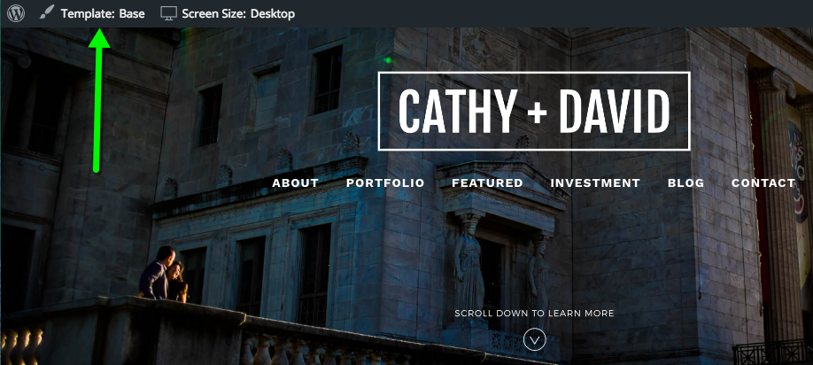
The first of these is a display of what ProPhoto template is applying to the page you’re currently viewing. It looks like this:
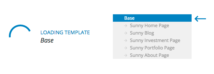
That’s an easy way to always see and know what template you’re viewing. And, when you click it, it loads up the ProPhoto 6 customizer with that template pre-selected for faster customizing:
By the way, the customizer also now remembers the template you were working in if you refresh the page, so you don’t have to reselect it as well.
Responsive screen size
The second cool thing in the front-end admin bar is a display of what screen-size you’re currently viewing at, as shown here:
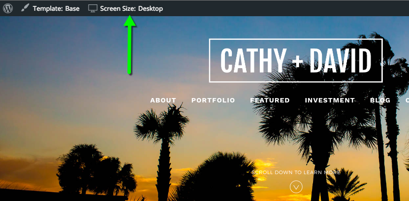
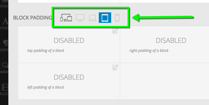
As you drag your web browser window bigger and smaller, you’ll see that this changes from phone to tablet to laptop to desktop. These screen sizes exactly correspond to the responsive breakpoint customization overrides we offer inside the customizer:
We’re hoping this live display of your current responsive screen size makes it even easier to dial-in your P6 responsive settings.
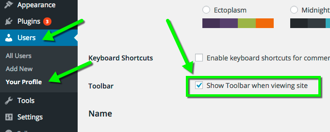
Enabling the admin bar
If you don’t see the WordPress admin bar on your front-end, you may have to enable it. To do so, just go to “Users” > “Your Profile” and make sure to check the “Show Toolbar when viewing site option, and save.