


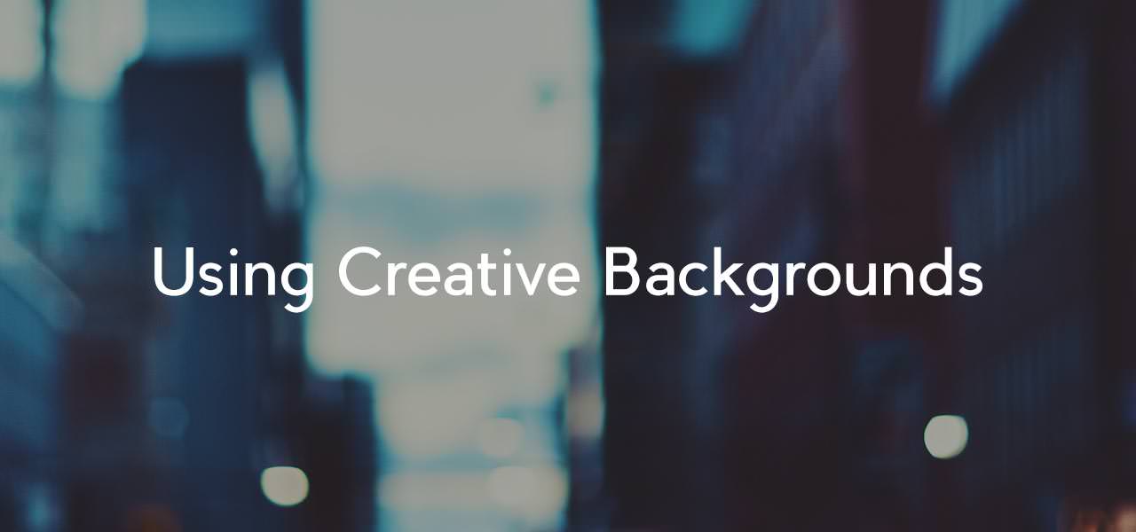
The ability to add a background for every block, row and column on your site presents a world of design possibilities. Your main site background from “ProPhoto > Customizer > Background” is what sits under every layout item in your template. Normally this is set to some default color that works well. The creativity tends to be in how layout item backgrounds are used. We get a lot of questions about how to do certain things that involve background images so I thought it would be good to share them here.
Backgrounds that fully cover automatically
Any block, row or column can have a background image set to a background size of “cover entire element with image.”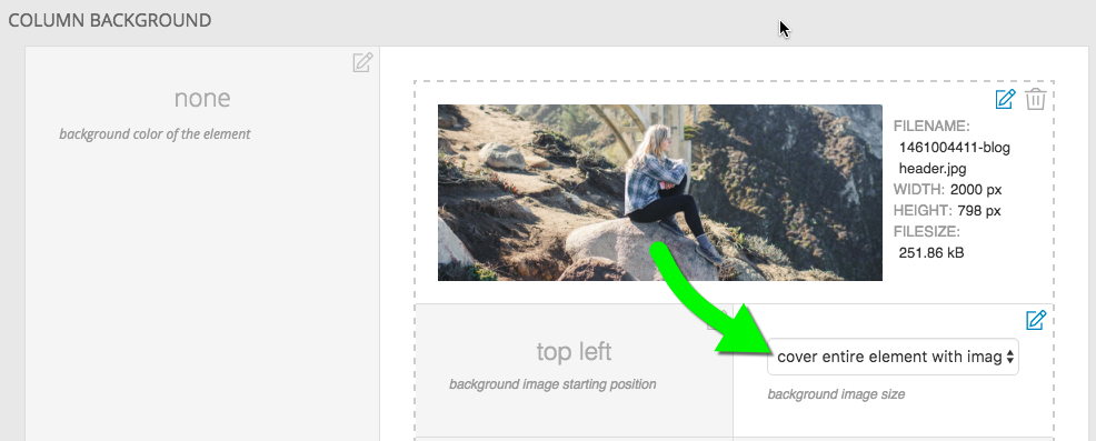 This handy tool causes the image to always cover the full size of the layout item as it shrinks and expands in a responsive environment. The free design called Square uses this feature to great effect. Many of it’s pages share some sidebar widgets in a left column and then a header image to the right that is different for each template. Here is what the layout looks like.
  The right column does not have any widgets, only a background image. The height of the widgets in the left column sets the height of column on the right. As the browser changes size, more or less of the background image is revealed. This image is set to an alignment of top and left. The woman is central in the image so a better choice might have been to set the horizontal alignment to center.
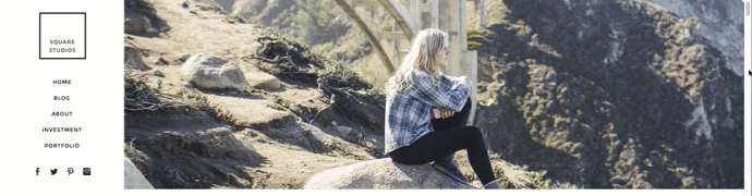
The right side starts getting cropped at a certain point because of the left alignment.
Aspect ratio
There is cropping involved when a background covers an area so carefully consider the aspect ratio you use and the composition of your image. In the example above the column is wider then it is tall so a landscape oriented image with a central focus works best.
Full window backgrounds
These are becoming more and more popular – sites that feature a background image that completely covers the initial browser window. The home page of the Homer design in our store is a good example.
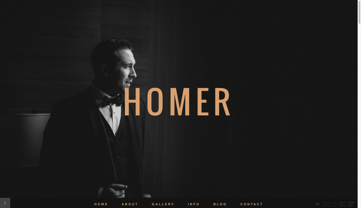
The background image fully covers the browser window on initial load
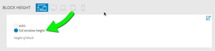
This time a block background is used for the top block in the template for the landing page. The block with this background image should be at the top of the layout if that is the first thing you want visitors to see. Besides setting the background size to cover, the key to making this work is setting the block to occupy the full window height in “ProPhoto > Customizer > Layout > Block > Block Appearance > Block height.”
Any widgets you add to the block will appear on top of this background image. Use top padding on the row or column as well as the vertical widget alignment options to dial in the position of the widgets on top of the background.
A scroll-to link is a good idea if you don’t have a menu immediately visible. You can set a tile, image or menu link to scroll to a block or row lower in the same page.
Background galleries
Blocks can also display a gallery as a background instead of a static image. All ProPhoto galleries are created in “Galleries > Add New”. When editing a block, choose gallery for the background style. Then select the gallery and gallery style you desire.
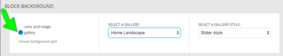 Images in a block background gallery will automatically cover the entire element and center horizontally and vertically.
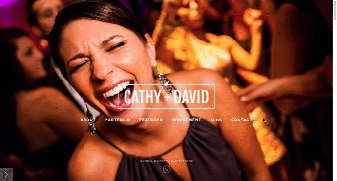
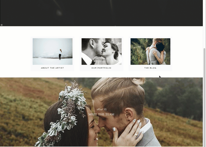
Cathydavidphoto.com features a full height landing page background gallery overlaid by a few rows of widgets.
Parallax background images
Selectively applying fixed background images to some blocks and a solid color to others achieves a parallax effect as you scroll down a page with multiple blocks. Check out our free Morgan design, to see an example. If you are interested in applying this look to a page on your site try these steps.
- Create a child template and assign it to the page where you want the parallax effect.
- Make sure you have multiple block sections in your site layout in “ProPhoto > Customizer > Layout”. Each block can be filled with any widget content you might want. This is going to create the horizontal ‘stripe’ areas where you see either a solid color or a static background photo. The height of the widgets and the top/bottom padding will set the height of each block.
- Edit the blocks for which you want to show a parallax background image scrolling by underneath. Set the background color to be transparent. Any rows and columns inside that block should have a transparent background, as well.
- Upload a large photo (2-3k pixels wide but still compressed) to act as the background image and set up these options for the background image:
starting position – top center or center center recommended
image size – cover entire element with image
tiling – do not tile
scrolling behavior – fixed - For other blocks, set a solid color as the background. You’ll want to alternate between blocks with color and blocks with the fixed image background.
Repeat steps 3, 4 and 5 for various blocks, and you’ll notice that as you scroll down your site the background image can be seen through the blocks that have the fixed background image, and that it changes as the new block background image scrolls by.
If you don’t see the image, but a solid color instead, double-check that the row and column items in the blocks aren’t adding their own background colors to overlay the block’s background. You might want to experiment with the top or bottom padding (or both) for blocks which act as parallax background ‘see through’ stripes, so you can impact how tall each stripe of background area appears to be.
Notice how the fixed background images show underneath and the blocks with solid color backgrounds seem to slide over top of them.