A little more than a month ago, a feature called “sticky blocks” was added to ProPhoto 6. When vertically scrolling a page this sticky option makes it possible for the content of a block (maybe the logo or a menu) to stick to the top of the browser window. This is great for encouraging viewers to visit other areas of the site, especially when on a page with a lot of content, like your main blog posts page. We’ve seen a few sites taking advantage of it, but we’d love to see more!
Any block item in “ProPhoto > Customizer > Layout” can by made sticky. Simply hover the block and click the image of a tack.

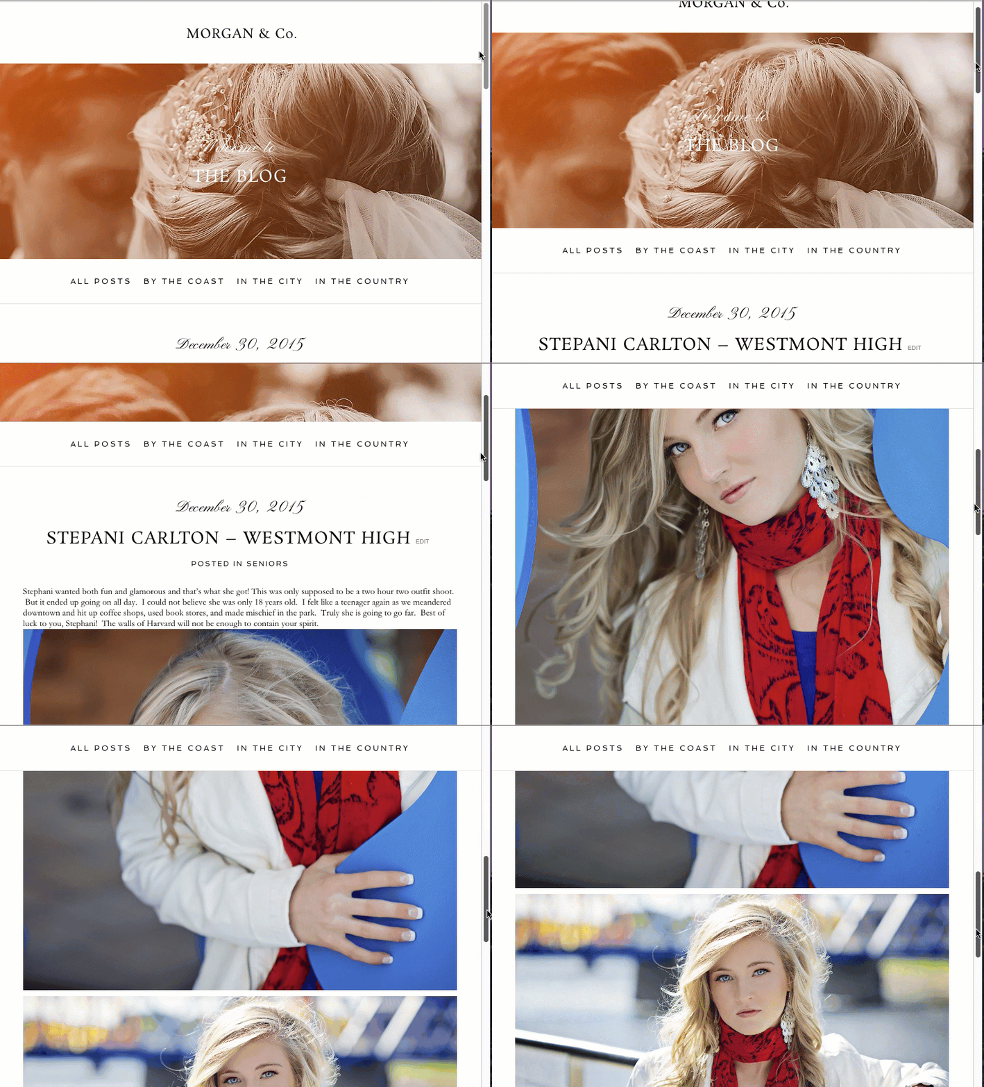
Whatever is in that block will then stick to the top when it hits the top of the browser window. If you only want a menu to stick to the top (which is pretty common) then create a block that only contains a menu widget. This is what is shown in the gif below. Notice how the menu that sticks starts does not have to start at the top of the layout.
Can I change the appearance of the sticky block once it hits the top?
Yes! You have a few block customization options that you can change for only the sticky state. Click on the gear icon for the sticky block. Any customization area that has a pin image near the viewport breakpoint images can be customized for only the sticky state.
For example, if you don’t want the block to be as tall when it is in the sticky state you could reduce the top or bottom padding after clicking this sticky icon (shown above).
Can I turn the stickiness on/off based on viewport width?
Yes! You can do this as well, although it’s not really a feature specific to sticky blocks. If you want a block to be sticky on, say.. all devices except small mobile devices, you would create two separate blocks. Using layout item responsive breakpoint visibility options, one block would be set to display on tablet, laptop and desktop, and the other (non-sticky) one would be set to display on mobile phones.


