


In my last two blog posts, I’ve outlined some of the progress we’re making on the next major version of ProPhoto. I also indicated that our desire was to move to a wider, paid public beta period in mid-January, if possible.
A lot of you have been clamoring for an update, so here goes. We are not 100% fixed on this date, but, barring something unforeseen, we are tentatively planning to stick very close to that announced timeframe by going to public beta on Tuesday, January 26.
As I’ve indicated in previous blog posts, the beta version of the new ProPhoto has been re-written nearly from scratch to be natively responsive and unbelievably flexible. Because of the breadth and depth of the changes we’re making, the early weeks of the public beta period will be best suited for customers with a bit of tech-savvy and a stomach for lots of changes. There will be some good-sized features not implemented, and probably some small bumps along the way for some users. If that doesn’t bother you, we definitely welcome you to jump on board and purchase at the earliest opportunity. If you want just a little bit more stability and a few more features, just hang tight for a few weeks — we are going to be iterating super-fast in the early lifecycle of the beta release.
We will also be very shortly publishing a roadmap of features and capabilities not yet in the new version and our approximate order and timeframe for adding them, that will help you decide when to jump in, based on which things are most important to you. Stay tuned here for more info.
Teaser: Multiple Templates
We are just now finishing up one of the biggest new features coming in the next version: a feature we call “Multiple templates”.
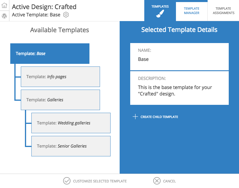
In the new ProPhoto, a “Design” is composed of at least one, but possibly many “templates”. Templates are like sub-designs — they constitute both the arrangement/layout of your site, and it’s customized appearance. Templates are hierarchical and inherit from each other.
What does all that mean? It means, basically that you can set up a base layout and look and feel (that is, a base “template”) that your site will use on every visited page. But then, if you want certain page types or blog post categories, or even specific pages to look differently, you can create a child template with as few or as many modifications as you like, and apply that template to whatever pages or page types you desire.
A commmon scenario might be this: you have a basic site layout and appearance you love. But on your galleries pages, you want to eliminate some widgets, part of the header, the footer, and also make your site use the absolute full-width of the browser window to really show off your images. With multiple templates, you’ll just create a child template, make the changes to your layout and appearance you want, and set that template to be used by your galleries.
Here’s a screenshot of what the management screen for your templates looks like:
Then, you apply your templates in a screen that looks like this:
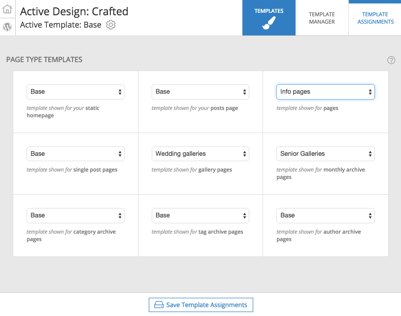
Your alternate templates can differ just a little – or differ wildly. You can reorder elements, remove things, add things, whatever you want. This will allow different parts of your site to have totally different (or slightly different) designs and appearances, and will give you a ton of granular flexibility. We think you’re going to be pretty excited about the possibilities.